Here are some samples of my work.
Virtual reality
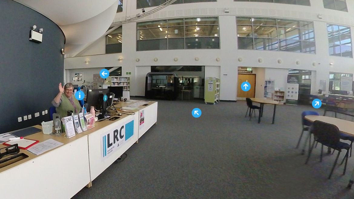
LRC virtual tour
This is a virtual tour of a college library, showing where specific resources are and where to get help.
Tools: Thinglink, 360-degree camera
Videos
Canva Tutorial
Purpose: To introduce educators and students to using Canva for the first time. I show them how to navigate, create basic designs, use elements such as photos and graphics, and download their designs.
Tools: Canva, Davinci resolve, screen recording app.
Accessibility considerations: Captions, contrast, on-screen text for emphasis.
Response: After sharing this in my workplace’s digital skills community of practice, a Learning Technologist called it a “fantastic resource”.
LRC tour video
Purpose: To introduce educators to the LRC and raise awareness of the resources and support available from LRC staff and Academic Services staff. It was part of our Festival of Learning – an annual CPD event for educators.
Tools: Canva, Drone, ClipChamp, Ableton, PowerPoint.
Response: The director of our department liked this video so much that I was sent to our sister college in Scunthorpe to make a similar video there.
Microsoft Forms tutorial
Purpose: To introduce educators to the Microsoft Forms app for creating quizzes and feedback forms.
Tools: Screen recording app, ClipChamp, Davinci Resolve, Canva.
Accessibility considerations:
Captions, simple language, contrast, clear narration.
Presentation
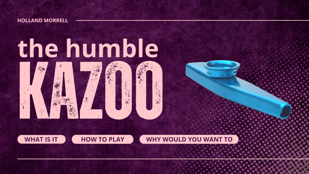
Kazoo presentation
>> View presentation here <<
Purpose: A sample presentation to showcase my skills in the creation of teaching and learning resources.
Tools: Canva, PowerPoint.
Accessibility Edits
As a sample project, I asked a lecturer for some real examples of teaching slides, and made accessibility edits on them.
Before
After
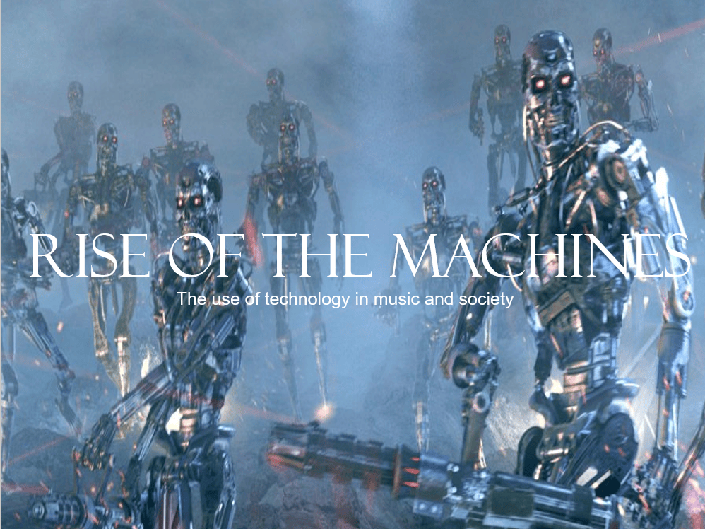
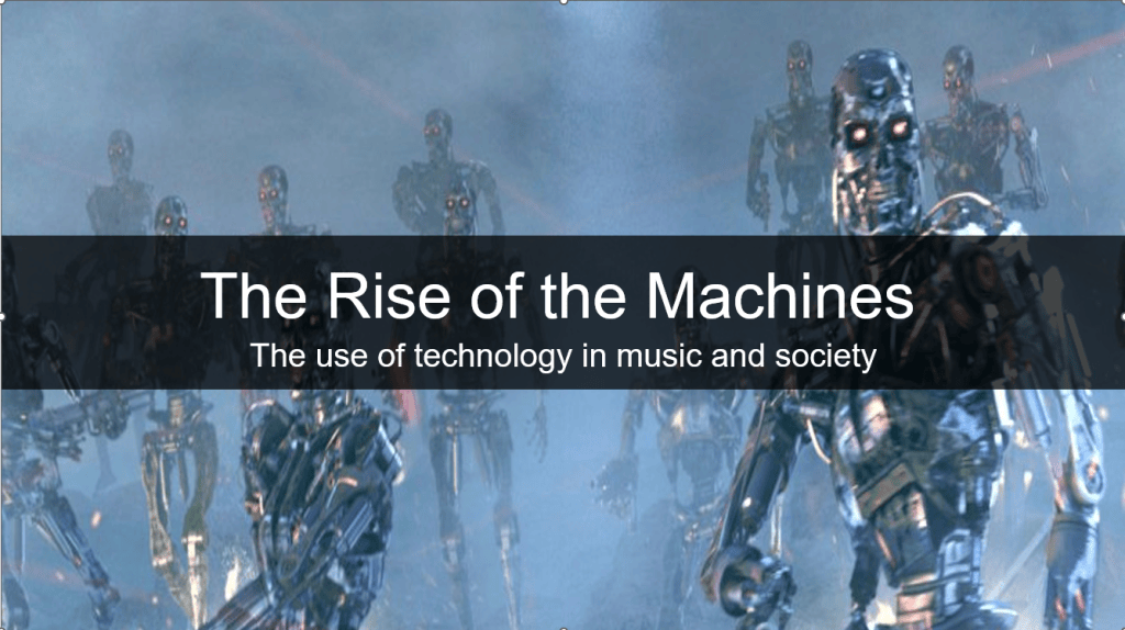
I changed the aspect ratio to 16:9 to fit modern screens, changed the title to a sans-serif font and changed it to sentence case (not capitals), gave it a semi-transparent black shape behind to increase the contrast for readability, and added alt text to describe the image for screen readers.
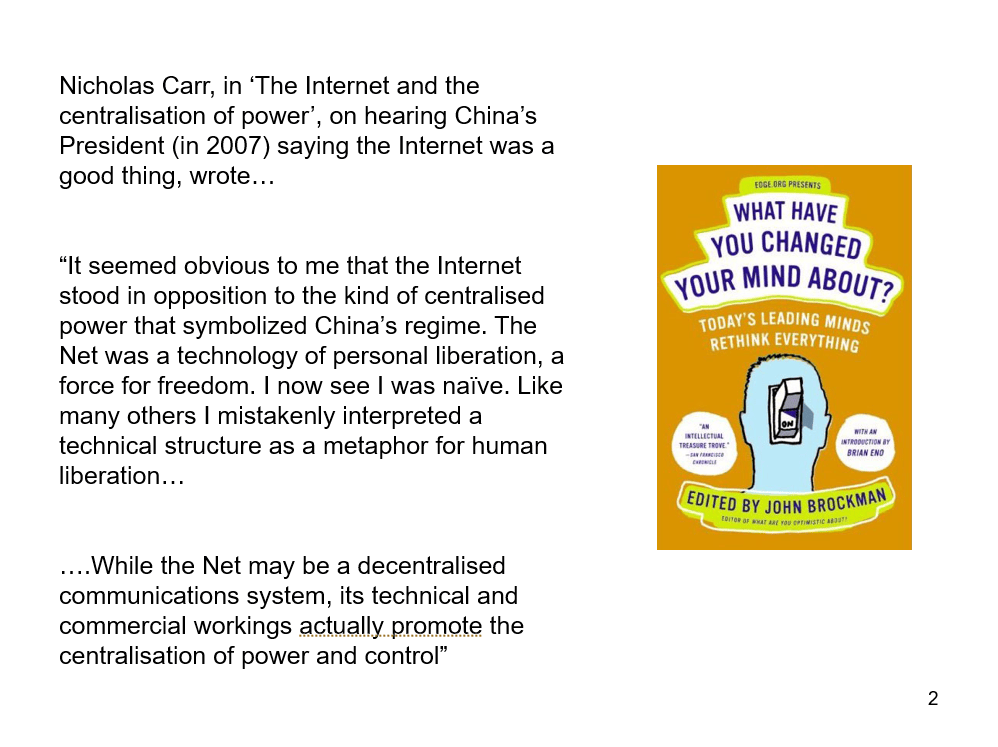
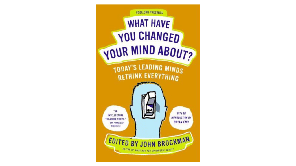
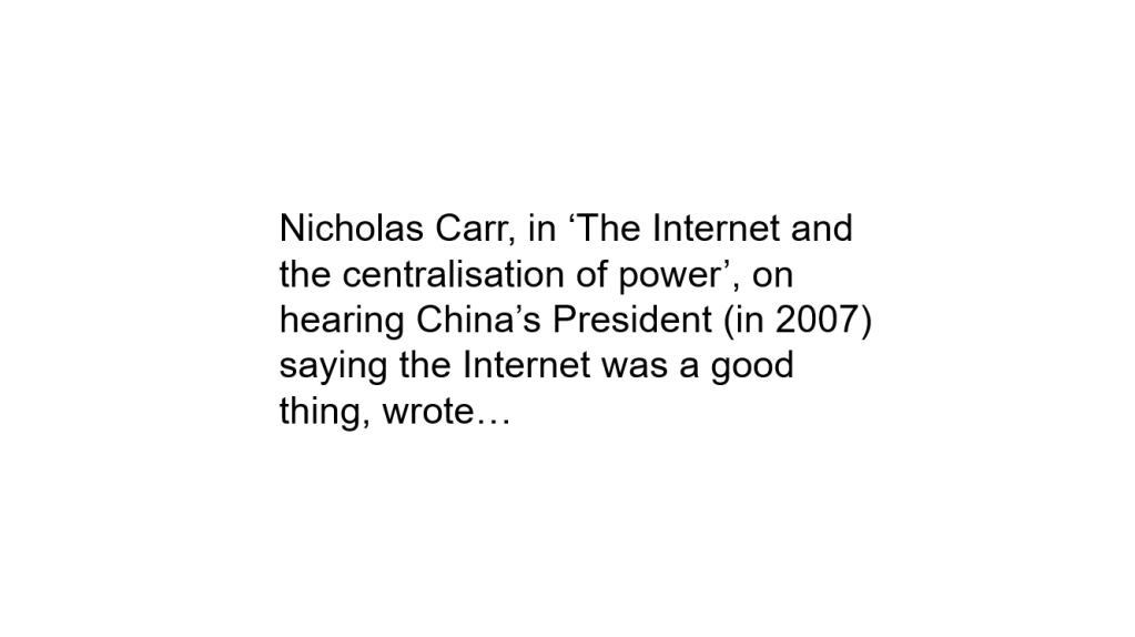
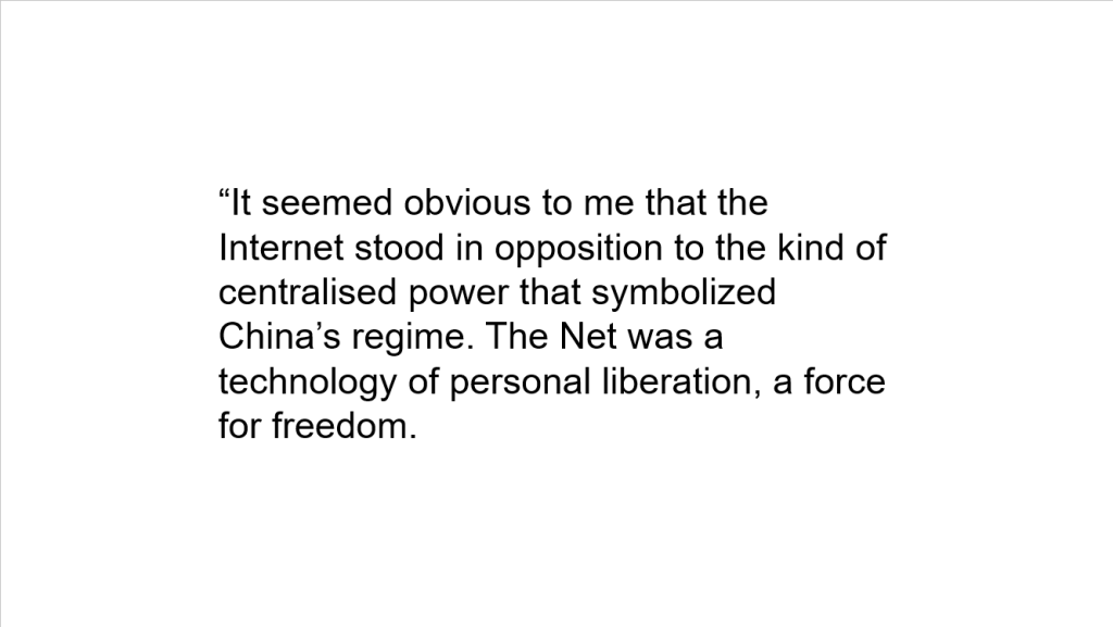
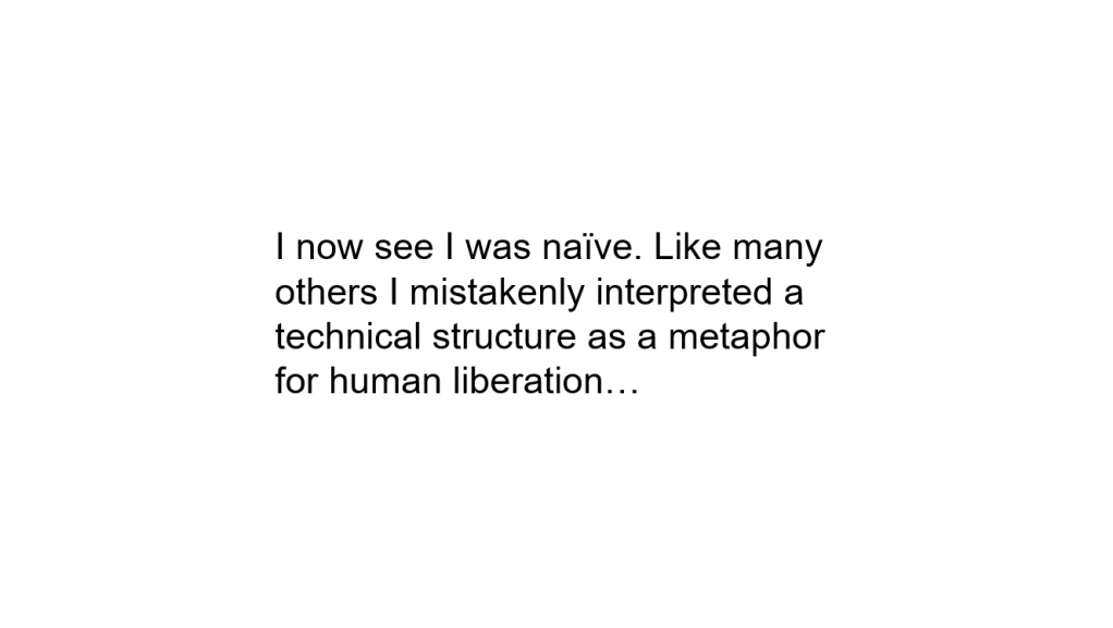
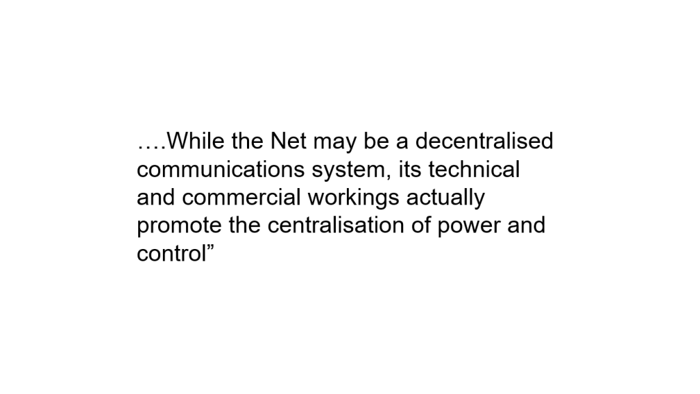
This was a lot of content for one slide, so I chunked it into five slides and added alt text to the book cover image. Each slide now has plenty of white space, with a centralised but left-aligned block of text. The unnecessary slide number has been removed, and the aspect ratio is now 16:19.
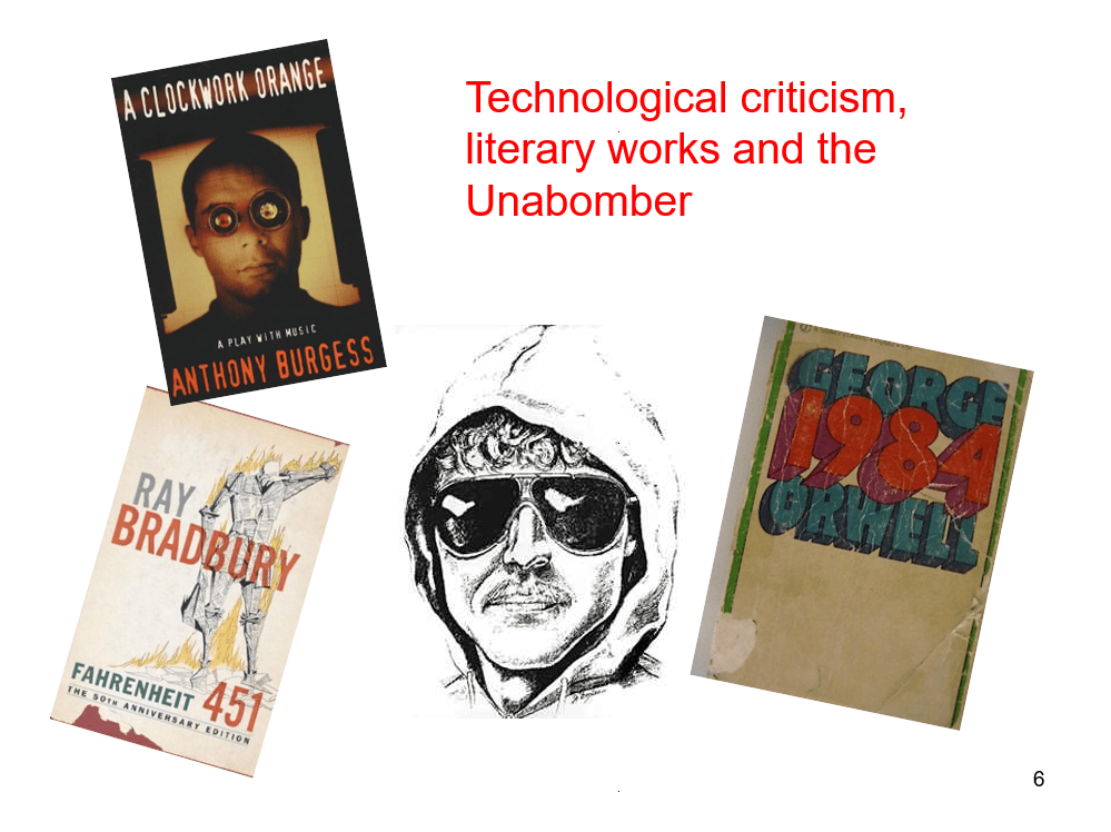
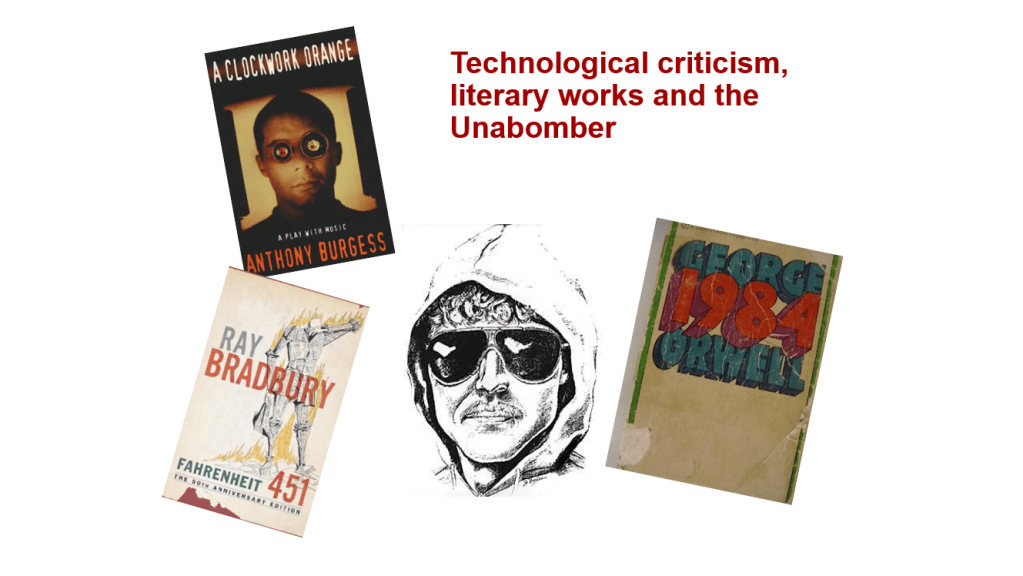
This doesn’t seem much different, but the text is darker and bolder for better contrast, and all images now have alt text. The unnecessary slide number has been removed, and the aspect ratio is now 16:19.
 Holland tech